Tag: graph

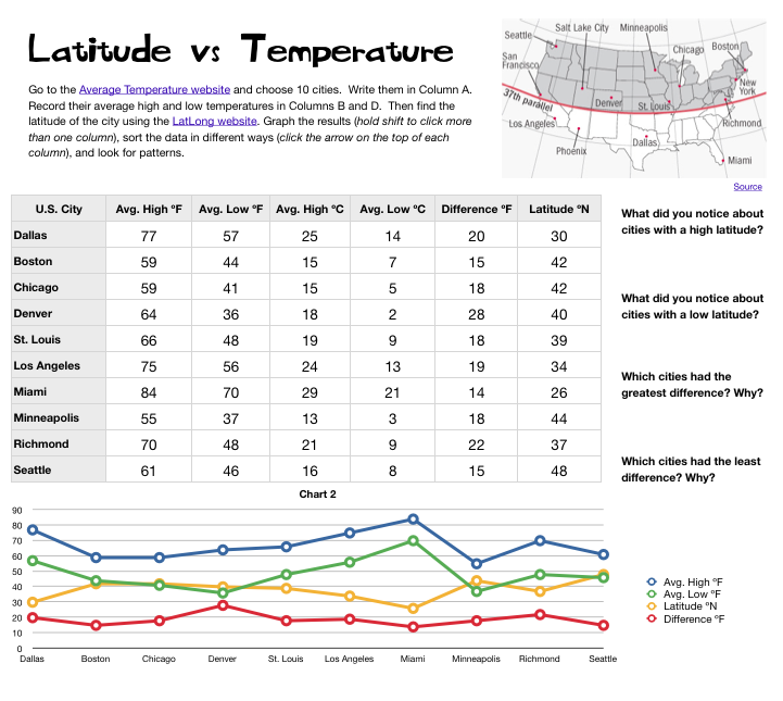
5th Grade 3-D Ocean Model

Screen shot 2013-12-08 at 3.36.44 PMFifth graders in Ms. Payne’s class at Laburnum Elementary have been studying the ocean (SOL5.6), and she wanted me to help them review the different parts of the ocean floor. One of my goals this year is to help our students improve in math, so I’ve been trying to incorporate math into as many of my lessons as possible. I figured we could use the 3-D area graph in Numbers to create a model of the ocean and then import it into Keynote to animate it like this example. I wanted the students to gather their own data, but just graphing that wouldn’t produce a good looking model. So I created a template that you can download by clicking here that takes the data they enter and turns it into a model of the ocean floor. The students used Google Earth to gather the data for the graph. First I told them to find a continental shelf and measure the depth. Google Earth automatically tells the ocean depth or land elevation for whatever spot your mouse is hovering over… just be sure it’s in meters and not feet or my formulas won’t work (you could add a bit more math by having them convert the units). Next the students find a continental slope, continental rise, abyssal plain, and sea mount to measure. After entering all that data, I told them to do some research online to find the depth of the Mariana Trench. I gathered a bunch of sites for oceans research into a BundleNut that they could use, but one of the coolest infographics I found was this one. Once they entered that last bit of data, the 3-D graph should look like a model of the ocean floor. Then they copied the graph and pasted into a Keynote to animate it. Keynote has a sharp-looking animation for graphs called “3-D grow.” The students used text boxes to label the different parts, and the final step (if we got to it, which we didn’t) would be to record a voiceover explaining each part of the ocean floor.


5th Grade Graphing Latitude Temperatures

5th LatVsTemp PictureMs. Elsea at Davis Elementary had a great idea to challenge some of her math students. She wanted them to research the high and low temperatures of cities at different latitudes in the United States. Then she wanted them to compare the data, look for patterns, and try to infer reasons for the differences. So she asked me to help them with the graphing part. I created a Numbers template for them to use that you can download by clicking here. After students entered their data, I showed them how to graph it as a line graph. Even though a line graph is traditionally used for showing changes over time, it works well with this data since there were several things we were looking at and the relationships wouldn’t have been as obvious with a bar graph. Once we graphed the data, some relationships were very clear. As predicted, cities with the lowest latitudes had the highest temperatures. But one of the most surprising pieces of data was that cities in the mid-latitudes had the greatest differences between their high and low temperatures. We discussed possible reasons for that. Then we tried sorting the data in different ways. I showed them how they could click a column heading (like high temperature or latitude) to sort by that category. They were surprised how their graphs automatically changed as well. This lead to more interesting discussions. Overall, the students learned a lot about the relationship between latitudes and temperatures that they can take back to their classmates to share with them.


4th Grade Virginia Resources Graph

Screenshot VA ResourcesFourth graders at Davis Elementary have been learning in science about the different natural resources produced in Virginia (SOL4.9). In math they’ve been learning about graphing. So today we did some research to gather hard data about Virginia’s resources and graphed the information we found using the Mac spreadsheet program, Numbers. First we predicted which resources are the top ones produced in Virginia. Many students guessed coal and tobacco. Next we went online to two sites I created about Virginia’s mineral resources and farm products. (I created my own sites because the sites with the data, which I cited, did not have any pictures so students may not have known what those products were… like I didn’t know what “broilers” were). I pointed out that the data is hard to visualize when it’s just a list of numbers. That’s how graphs help! So the students selected which data they wanted to graph and entered the information into a Numbers template that you can download by clicking here. Then I showed them how to graph the data and customize the colors. Finally they made up a few questions of their own about the data for a partner to answer.


1st Grade Recycling Graph

First graders in Ms. Murray’s class at Laburnum Elementary have been learning about recycling (SOL1.8). They have also been learning about graphing. So we wanted to see if they could collect some recycling data and make a graph about it (and even do a little bit of data analysis on a first grade level). I created a Google Form for them to collect their data. You can view the form by clicking here. They collected data about what they recycled at home and also wrote about things they reuse or try to reduce using at home. After everyone entered their information, I showed them the data set (you can see it here). We discovered that when the data is presented like that, it doesn’t make much sense. So I gave them a Numbers template for graphing the data. You can download it here. The students entered the information about what their classmates recycled and noticed some patterns right away! They were able to discuss ways they could improve their recycling habits at home. You could adapt this idea to almost any data collection and graphing lesson. Let me know how I can help!


4th Data Collection & Graphing with Google Docs

Today 4th graders at Laburnum collected data from their classmates and graphed it using Google Docs. First we decided what we wanted to know about our classmates. We wanted it to be useful and authentic. So for example, one student noticed that his friends were sleepy, so he wanted to find out what time they go to bed. Another student wanted to know what problem her friends struggled most with at school. Others wanted to plan the next team game for recess or find out what treats the teacher should bring in for an upcoming class reward. Once we chose our question, I showed them how to create a form in Google Docs. I also showed them how they could change the theme to make it relate to their topic. Next students traveled around the room filling out each others’ forms. So everyone had plenty of data. I showed them how to look at all their data in the Google spreadsheet and how to sort it in a variety of ways. We sorted it by the question answer so they would be grouped together for easy counting. They counted the different answers and graphed them for the last step. You can take a look at some sample forms with the accompanying data/graphs below:
Stephany – What’s Your Favorite Candy? (data & graph)
Sedbreion – What Time Do You Go To Bed? (data & graph)
Precious – What Are You Having Trouble In School? (data & graph)


Kindergarten Colors Graphs

Do you know what’s the favorite color of most people around the world? According to this international study, blue was preferred across genders, countries, and age groups. (My personal favorite color is orange… what’s yours? Leave a comment 🙂 Today kindergarten students at Laburnum did their own research and created graphs about their favorite colors. I gave them a template that you can download by clicking here. The students collected and added the data. The template is set up to automatically build the graph as the data is entered. Next I showed them how to change the colors of the bars so they matched the colors they represented. When they were finished the students answered the two questions at the bottom. They are set to automatically change the color of the word to match the color and to check if the answer is right or wrong. You can see the picture bigger by clicking on it.


1st Grade Animated Graphs with ActiVotes

First graders at Holladay created animated graphs about their pets today. First we used the ActiVotes to collect the data. I’ve explained how to use the ActiVotes without a Promethean board on my blog here, They are a great way to get instant responses from all your students and to review graphing. Once the students voted on their pets they opened a Keynote template that you can download by clicking here. The students entered the data through the Inspector (they clicked Chart Inspector > Edit Data) and the graph automatically appeared. The reason I wanted to do it in a Keynote rather than Numbers is because in Keynote there is a special animation for graphs called 3-D Grow. It’s really cool. You can see it in action by clicking here. I also like Keynote because you can click Themes and the graph changes along with the theme. You can see how the slides look different in the Animoto video below. By the way, Animoto is a great way to present photos on your website.


Trackpad Practice in Kindergarten

It’s great to see kindergarten students already using the computers this week! One of the first lessons we do in kindergarten is to show them how to use the trackpad, especially how to click and drag. At this age, they are still developing their fine motor skills, so they need lots of practice. I created this online apple graphing activity to help get them started. First we vote on our favorite apples (red, yellow, green, or other), count the results (or use the ActiVote clickers), and then drag the apples on the graph to show the correct amounts. It not only gives them practice clicking and dragging, but it also reviews some important math concepts. Finally, I’ve gathered together several other websites that give additional practice using the trackpad here.


Tags:


Kindergarten Graphs

Today at Trevvett we had a delicious graphing lesson with Lucky Charms in kindergarten. I gave them each a handful of Lucky Charms and a Numbers template to get them started. You can download the template by clicking here. The students sorted their marshmallows into groups and counted them. Then they started entering the numbers into the spreadsheet. As soon as the students press the Enter key after each number, the spreadsheet automatically generates a bar graph with pictures, or a pictograph, of the marshmallows! After the graph is finished the students could ask their neighbor questions like, “Which type of marshmallow had the most? had the fewest? had the same? How many pots of gold did I have? etc.” Then, of course, the students could eat their Lucky Charms!


4th Grade Ordered Pairs Database

In fourth grade at Laburnum today we combined a database lesson with a lesson on ordered pairs. I gave each student a Numbers template which you can download by clicking here. The template has a link to an online form for each student to enter some coordinates for a shape of their choice. They choose the x-coordinate, the y-coordinate, the shape, the color, and type their name. After all the students have entered their data, they open the next link which shows all the records. Now they are ready to enter this information into the Numbers document. As they type in their classmates’ coordinates, the points are automatically plotted on the graph. The final step is to use the Shapes tool to put the correct shape on the correct coordinates and change the fill color to the one specified. You can take a look at this class’s final copy by clicking here.