Tag: graph

4th Grade Probability Spinners

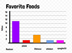
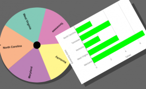
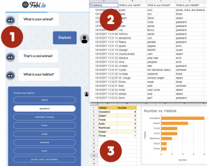
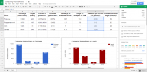
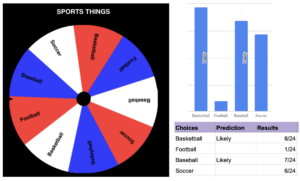
Fourth graders at Varina Elementary have been learning about probability (SOL4.13) and graphing (SOL4.14), so today students in Ms. Connell’s class created probability spinners and graphed the results. First, they chose a topic for their probability spinner, such as sports, animals, shoes, colors, games, foods, etc. Next, they opened a Google sheet and typed a list of items that belong with that topic in Column A (for example, if they chose sports, they might type baseball, soccer, football, basketball, etc.). I instructed them to list some items more than others to increase the probability for those items. Then we copied all of Column A and went to WheelDecide, which is a free, customizable, online spinner. We clicked the “Paste List” button and pasted our list into the box. Now we have a spinner with all our items on it. Back in our spreadsheet, in Column B, we predicted whether it would be “Likely” or “Unlikely” for each item to be selected by the spinner. Of course, multiple items would be more likely. We tested our predictions by spinning the spinner 24 times and tallied the results. Finally, we recorded the results in Column C of our spreadsheet and clicked the “Insert Chart” button to generate a bar graph of our data. You can see the students’ spinners and spreadsheets here.


Graphing with Google Drawings

Third graders at Varina Elementary have been learning how to collect data and create graphs (SOL3.15), so today students in Ms. Long’s class made graphs with Google drawing. Usually we use Google sheets to create graphs, but Google drawings are another great option. There are two features that I really like about graphing with Google drawings: You can easily change the color of each bar (in sheets, the default is one color for all bars), and you can resize the bars by clicking and dragging, which provides practice for the technology enhanced items (TEI) on our tests. First, we collected data by asking the students to answer a few polls within Schoology. You could also let the students create their own polls with Google forms, but I wanted to show the teachers this built-in feature of Schoology. The polls were on a variety of topics: favorite sports, foods, and colors. After the students voted, they opened a template (you can make a copy here) and chose the data they wanted to graph. Next, they edited the text boxes so the title and categories matched their data. I showed them how to click and drag the bars to the correct lines and change their colors with the paint bucket. Finally, we shared our graphs in Schoology and analyzed the data. We asked questions, like, “What is the most popular food?” or “How many more people like basketball than football?” The students noticed that graphs make it a lot easier to understand their data. You can see some of their graphs here.


Tags:


4th Grade Predicting and Graphing Virginia Rivers

Fourth graders at Trevvett Elementary have been learning how to make graphs in Math (SOL4.14), and they have been studying the major rivers of Virginia in Social Studies (VS.2). Today, students in Ms. Catlett’s class predicted and graphed the lengths and discharge rates of the rivers. First we located the rivers on Google Maps. I created the map with different layers so that you can click the check boxes on the side of the map to turn on/off the rivers and/or the Virginia border as you discuss each one. We looked at the map scale at the bottom to try to predict the lengths of each river. If you wanted to show your students the watershed for each river (Science SOL4.9a), a great research tool is Streamer. Click the “Trace Upstream” button at the top, then click on a river, and the entire watershed will show up in red. I was amazed at how big the Potomac watershed was and how far it reached into Virginia! After discussing the lengths of the rivers, we tried to predict the discharge. Discharge is the volume of water flowing out the end of the river, measured in cubic feet per second (cu.ft./s). A cubic foot is about 7.5 gallons. We estimated the discharge rate of each river, taking into account their total length, watershed area, and size of the mouth (where it empties into the bay or ocean). Many students automatically assumed that longer rivers would have greater discharge rates, so I asked them a question to help clarify this misunderstanding. Does a longer hose have more water coming out the end than a shorter hose? What does affect how much water flows out the end of the hose? (Water volume, speed and the width of the hose). Does the discharge rate stay the same for each river, like its length? What would make the discharge rate change? (Amount of rainfall). Students recorded their predictions on this spreadsheet. Then they did some research to find the answers. Wikipedia has the information as well as simply asking Google, “What is the length/discharge of the ___ River?” The students entered the correct data into their spreadsheet and compared it to their predictions. Finally, I showed them how to highlight the data and graph it. The graph makes it very easy to see relationships between the rivers. You can see a few student examples here and in the screenshot above.


Tags:


4th Grade Virginia Tally Marks & Graphs

Fourth graders at Varina Elementary have been learning about Virginia geography (VS.2) and Jamestown (VS.3) in Social Studies, and they have been making bar graphs in Math (SOL4.14). Today students in Ms. Belcher’s class chose a Virginia topic, created a spinner out of its subtopics, tallied the spins, and graphed the results. First, we reviewed various topics they could use to generate their spinner subtopics: Virginia Rivers, Virginia Regions, Indian Language Groups, Problems at Jamestown, Bordering States, etc. Next, we created our custom spinners using a cool webtool called WheelDecide. Then they spun the spinner as many times as they could in two minutes and tallied the results on paper. To make the graph, we used a Google spreadsheet. I showed them how to access their Google shortcuts (the array of 9 tiny squares in the top right corner of a Google search page), and we opened a new spreadsheet. In the first column we typed the spinner subtopics, and in the second column we typed the number of tallies for each one. Then we highlighted the columns, pressed the graph button, and a bar graph appeared! I showed the students how to change the colors of the bars, if they wanted. We shared our spreadsheets on Schoology, but you can see them all here. Can you guess the main topics just by looking at the graphs?


3rd Grade Animal Habitats Graph

We’re on an animal habitats streak here! In previous posts I’ve shown how your habitats unit (SOL3.4) can reinforce the skills you are teaching in Social Studies and Reading. Now we’ll see how it can reinforce Math concepts as well. At Trevvett Elementary, third graders have been learning about graphing (3.17), so today students in Ms. Bae’s class practiced graphing animal’s habitats. First we had to collect some data. I used Fobio to convert a Google form into a chatbot to make the process a bit more interesting. You can try the chatbot out for yourself by clicking here. Once the students had entered their information, I took a screenshot of the results spreadsheet and posted it to Schoology (step 2 in the graphic accompanying this post). Next the students opened a blank Google spreadsheet and typed the habitats in Column A and the number of animals in Column B. I showed them how to use the new “Explore” feature by clicking the star shape in the bottom right corner. From the pop-up window they could change the colors of the rows and automatically add a bar graph (step 3 in the graphic). I explained that they could also change the colors of the bars by double clicking on one of them, then clicking the paint bucket in the pop-up window. The students shared the links to their spreadsheets on Schoology. You can see an example here. (UPDATE: The next day at Holladay, Ms. Haley’s class combined Math & Science by writing math word problems about animals. See them here).


3rd Grade Graphing Plant Growth

Third graders at Trevvett Elementary have been studying plants (SOL3.5), measurement (SOL3.9a), and graphing (SOL3.17), so today students in Ms. Hufnell’s class learned how to graph their plant measurements using Google sheets. Over a 4-week period, they have measured and compared the growth of kale and brussels sprouts in the Trevvett Learning Garden. They had their data, and now they were going to analyze their data. I gave them each a blank Google sheets template in Google classroom. Before they recorded their data, we discussed how it should be organized. Should we put the plants in Column A and the dates in Row 1 or the reverse? (Most put plants in Column A). Would that affect the way the graph looked? (It didn’t, necessarily, because of the customization features under Chart Types). I explained that they would need to put their units of measurement as a label on the graph instead of in the data cells, otherwise the graph wouldn’t recognize the numbers (for example, put 5 instead of 5cm). After entering our data, we highlighted it and clicked the graph button. I showed them how to use the Customization tools to change the title and labels on each axis. Then we inserted the chart into our spreadsheet and moved it so it wasn’t covering up our data. Finally, the students clicked the bars to change their colors (use the paint bucket button). The graph made it easy to analyze and compare the plants’ growth. Which plant grew fastest? Which plant grew tallest? Why did the kale not grow at all for 3 weeks? What might be the reasons for the differences since they were both in the same garden with the same sunlight and rainfall? We published our spreadsheets and pasted the links to Google classroom. You can see an example here.


Tags:


5th Grade Comparing Virginia Rivers

Fifth graders at Laburnum Elementary have been reviewing the rivers of Virginia (VS.2c) and watersheds (SOL4.9) in Social Studies and Science. They have also been multiplying decimals in Math (SOL5.5a). So today students in Mr. Hofilena’s class used those skills to compare Virginia Rivers. First we discussed ways to compare the rivers. Everyone agreed that we should compare the length, but I also suggested comparing the discharge. Discharge is the amount of water flowing down the river, measured in cubic feet per second. We discussed factors that influence discharge: river depth and width, rainfall, and the velocity of the current. Next I gave them a Google Sheets template that you can copy here. The students had to do their own research to find the length and discharge for each river (Google “River name length” and “River name discharge”). They entered the data into the correct cells on the spreadsheet (using only numbers, no units). Then I showed them how to highlight the data and analyze it using the new “Explore” button in the bottom right corner. We used the Insert Chart button (top toolbar) to create graphs of the data. It was interesting to see how the length compared with the discharge. For example, the Rappahannock River is almost 6 times the length of the York, but its discharge is only 1.5 times that of the York. What does that tell us about the two rivers? We didn’t have time to do further comparisons, but I’ve added them to the template. You could convert the discharge to gallons per second with a formula (CELL*7.48052). Then convert that to bathtubs per second (the average bathtub holds 40 gallons) to help students visualize it better. You could also figure out how long it would take to drive the length of the river by dividing the total miles by 60 (assuming you are driving 60 MPH). You could even compare the rivers using the York as the unit. Take a look at a sample here.


4th Grade Data Collection

Fourth graders at Holladay Elementary have been learning how to collect, organize, display, and interpret data from a variety of graphs (SOL4.14), so today students in Ms. Tonello’s class used the new Google forms to collect data. I’ve taught similar lessons in the past, but since then Google has added some cool new features. You can now add photos to each individual answer choice, you can mark answer choices correct or incorrect (for grading purposes), and there are new ways to explore your data. We tried out a couple of these features today. First, the students came up with topics they were interested in for collecting data. Since it’s the day after Halloween, many students chose topics relating to that. Next they signed into their Google drives and created a new form (click Create > New Form). They typed a title and a question for their classmates to answer. Some students added photos for each answer choice (click the photo icon). We published our forms and posted the links to Google classroom (click the Preview button to get the link). After the students responded to each others’ forms, they clicked “Responses” on their own form templates. This showed a quick pie chart of the results, but Ms. Tonello wanted them to create bar graphs, so we clicked the green button at the top to export the data to a spreadsheet. The spreadsheet doesn’t automatically tally the number of votes for each answer choice, so the students had to do that calculation. Then they highlighted the tallies, clicked the graph button, and created a bar graph of their results. Google Sheets has a new “Explore” button in the bottom right corner that lets you explore your data in a variety of ways. We didn’t get that far, but you can take a look at their forms here.


Tags:


5th Grade Scientific Method

captureFifth graders at Varina Elementary have been learning about the scientific method in Science (SOL5.1) and nonfiction text features in Language Arts (SOL5.6a). To reinforce those concepts, students in Ms. Rumans’ and Ms. Gallahan’s classes conducted a quick experiment and wrote about the scientific method they followed, including some nonfiction text features. First I made a copy of a blank Google doc for each student in Google classroom. I usually like to review word processing skills for my first technology lesson. I showed them how to add a title and change the font, size and color. Then we wrote about our experiment using the vocabulary words we have learned: hypothesis, independent variables, and dependent variables. I demonstrated how to make the important words bold (a feature of nonfiction text). Next we opened this template (I changed the Share settings to “Anyone with the link can edit”) and each student typed their name in column A using the row with their student number. First we timed how long we could hold our breath while sitting quietly using Google stopwatch (just do a Google search for “stopwatch”). Then we ran in place for a minute and timed how long we could hold our breath. Students recorded their times in columns B and C. The template automatically generates a line graph. After collecting our data, the students went back to their own Google docs and clicked Insert > Chart > From Sheets. They navigated to the spreadsheet we just completed and clicked on the graph. Finally we added a photo of ourselves holding our breath by clicking Insert > Image > Take a snapshot. I linked their individual documents to their names on the spreadsheet. You can check out Ms. Gallahan’s class results here.


4th Grade Polls from the Past

CaptureWith Presidential elections coming up next year, it seems that public opinion polls are popping up everywhere, asking Americans for their views on issues ranging from economics to the environment. Today students in Mr. Cochran’s class created public opinion polls from the past. They are currently learning about the Jamestown colony (VS.3) so they created created polls asking the Jamestown settlers or the Powhatan Indians for their input on different problems they faced. First they had to decide if they were going to poll the settlers or the Indians. Then I showed them how to create a Google form with a multiple choice poll question. We customized our forms by changing the header images and adding photos. Next the students walked around the room and answered each others’ poll questions as if they were a Jamestown settler or a Powhatan Indian. After the voting was finished, I showed them how to view the responses in a spreadsheet. The students graphed the results and posted them to Google classroom. You can see all of them here.