
5th Grade Graphing Latitude Temperatures
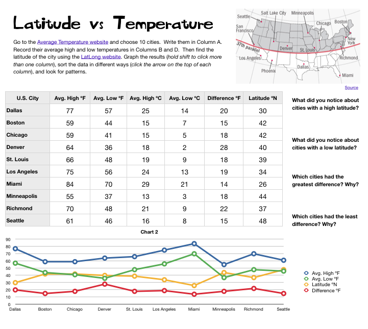 Ms. Elsea at Davis Elementary had a great idea to challenge some of her math students. She wanted them to research the high and low temperatures of cities at different latitudes in the United States. Then she wanted them to compare the data, look for patterns, and try to infer reasons for the differences. So she asked me to help them with the graphing part. I created a Numbers template for them to use that you can download by clicking here. After students entered their data, I showed them how to graph it as a line graph. Even though a line graph is traditionally used for showing changes over time, it works well with this data since there were several things we were looking at and the relationships wouldn’t have been as obvious with a bar graph. Once we graphed the data, some relationships were very clear. As predicted, cities with the lowest latitudes had the highest temperatures. But one of the most surprising pieces of data was that cities in the mid-latitudes had the greatest differences between their high and low temperatures. We discussed possible reasons for that. Then we tried sorting the data in different ways. I showed them how they could click a column heading (like high temperature or latitude) to sort by that category. They were surprised how their graphs automatically changed as well. This lead to more interesting discussions. Overall, the students learned a lot about the relationship between latitudes and temperatures that they can take back to their classmates to share with them.