Tag: graph

4th Grade Virginia Weather Graphs

VAGraph
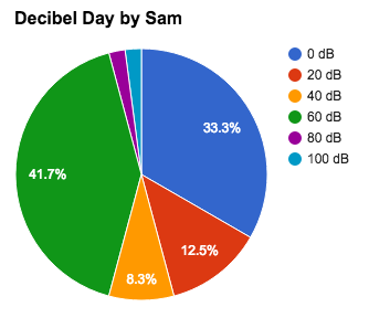
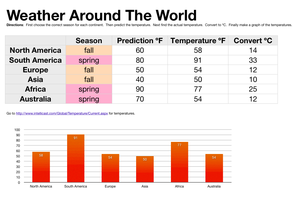
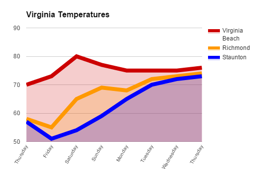
Fourth graders at Davis Elementary are learning about weather in science (SOL4.6), Virginia regions in social studies (VS.2b), and graphing in math (SOL4.14). So today students in Mr. Cochran’s class researched current temperatures in different regions of Virginia and graphed them. I gave them a template that you can copy here. First we clicked the “City” link and looked at the current temperatures in different Virginia cities. I showed them how they could click the column headings to sort by that category, so we sorted by temperature. We took a city from the highest temperatures (Virginia Beach), a city in the middle temperatures (Richmond), and a city in the low temperatures (Staunton). Then we located those cities on a map of Virginia and discussed why the temperatures might be different. The students noticed that the colder cities were further west (higher altitude) and north (higher latitude). Next we looked at the weekly forecast for the three cities (linked on the spreadsheet). Your students could choose their own cities to graph, but we just graphed the temperatures for the three cities we researched to save time. On the spreadsheet I showed them how they could click the “Thursday” cell and drag the small blue square handle down through seven more cells to have them fill in with the days of the week. Then they filled in the rest of the cells with the temperatures. Next we clicked the graph button and chose a line graph. I showed them how to customize the color and thickness of the lines, and we added a title. They posted their graphs to Google classroom, but you can take a look at some here.


1st Grade Flower Fraction Graphs

MykalaFirst graders at Laburnum have been learning about spring (Science SOL1.7) and fractions (Math SOL1.3). So today students in Ms. Wingfield’s class made spring flower fraction graphs. First we helped them log into Google classroom where I gave them a Google spreadsheet template that you can copy here (File > Make a Copy). The students had a choice of four flower bouquets photos. They picked one and deleted the others. Then they counted the number of flowers for each color. They typed the color and the number into the correct columns on the spreadsheet and a graph was automatically generated. Below the graph, you can see the fractions of the group. Click the sample tab at the bottom of the template to see a finished product. You can also take a look at the student samples here.


5th Grade Decibel Day

Screen Shot 2015-08-06 at 1.34.33 PMFifth graders at Holladay Elementary have been learning about sound in science (SOL5.2) and fractions in math (SOL5.2), so today students in Ms. DiMatteo’s class figured out the fractions of their day spent at different decibel levels. First we discussed what decibels measure (they are a way to measure the loudness or amplitude of the sound waves). Next we researched decibels using a variety of websites: Bouncy Balls, Dangerous Decibels, and the Interactive Sound Ruler. That last website has a valuable scale giving examples of sounds at different decibel levels. We used it to calculate the percentage of our day we spend at each level. I posted a Google spreadsheet template on Google classroom for the students to use. I made some changes to the template after teaching this lesson to simplify things. You can make a copy of the template here. It has some samples for you to look at in the tabs (sheets) at the bottom. Once we figured out how many hours we spend at each decibel level, we wrote a formula to convert it into a percentage. This is where we used fractions because the formula was a fraction with a variable in the numerator (# of hours)/24 hours. Next we highlighted all the percentages and created a pie chart. When the students posted their spreadsheets to Google classroom they estimated the fraction of their day spent at a certain level. You can take a look at some examples here.


1st Grade Graphs

Screen Shot 2015-03-26 at 12.48.12 PMFirst graders at Laburnum Elementary have been learning how to gather data by counting and tallying (SOL1.14) and how to display that data in graphs (SOL1.15), so today students in Ms. Tyler’s class practiced those skills using the computer. First we logged into their Google accounts (with lots of help) and went to Google classroom. I posted a question: “What is your favorite ice cream of these 3 choices: vanilla, chocolate, or strawberry?” The students clicked where it said “Add a comment” and typed their favorite flavor. They loved seeing their classmates’ names pop up. We counted how many students liked each flavor and wrote tally marks on the board. Next I posted a Google spreadsheet template to the classroom page and clicked the button “Make a copy for each student.” You can make a copy of the template to use with your class as well. The template has two tabs at the bottom. The first tab is the one the students will use. The tab labeled “Key” is a finished sample for your reference. I showed the students how to type the flavors in the first column (some of them needed help with that). Then they typed in the numbers. The graph will automatically build itself as the students type. We discussed what words we needed to add to the title and added “Ice Cream” to it. Finally I showed the students how to change the colors of the bars (click them and then click the paint bucket). That was all we had time for, but you could extend the lesson by asking questions like, “Which flavor had the most votes? the least?” Try graphing other favorites like colors, foods, animals, sports, etc.


5th Grade Ocean Floor Diagram

KasmiraFifth graders at Holladay Elementary have been studying the ocean (SOL5.6) in science, and they have been learning about line graphs in math (SOL5.15). So today Ms. Haislip’s students made line graphs of the Ocean Floor. First we had to collect our data. I showed them how they could use Google Earth to find the ocean depth at various spots. The goal was to take measurements at different places (the continental shelf, the continental slope, the continental rise, the abyssal plain, a sea mount, and a trench), and then enter that data into our spreadsheet. To save time, different groups of students could find a specific feature and share that measurement with the class. Next we opened a Google spreadsheet and wrote down the different features in the first column. We entered the depths in the second column. I explained that they would need to duplicate some of the measurements so that we would have a couple of points to plot (for example, the abyssal plain would need at least 2 equal points in order to make a straight line). Then I showed them how to make a line graph out of the data (it was actually an area graph so that it could be filled in with a color). I let them figure out how to adjust the data so that the resulting graph looked like the ocean floor. They learned the difference between negative and positive numbers very quickly! The final step was to customize the color and size and publish their graphs. I took screenshots using the snipping tool and posted them to CoMemories (which is a quick and easy way to share pictures). You can see their graphs here.


4th Grade Data Collection

4thWhiteFourth graders at Davis Elementary are learning about data collection and graphs (SOL4.14), so today, Ms. White’s students collected data from their classmates using Google forms. They chose a topic of interest to them and selected their own Google form template. Then they wrote their question, such as “What is your favorite thing to read?” or “Who is your favorite singer?” and provided four choices. I showed them how to load the live form, then they traveled around the room completing each others’ forms. At the end of the process, each student had between 16-20 responses. Now it was time to do some data analysis. They looked at the Google spreadsheet with the responses and counted the votes for each choice. Next they added that information to their spreadsheet and graphed the results. I showed them how to customize the fonts, colors, and labels of the graph. You can see all their graphs and forms by clicking here.


4th Grade Probability Spinners

probabilityMs. Thomas’s 4th graders at Varina Elementary have been learning about probability and predicting the outcome of events (SOL4.13) so today we created digital spinners to test our predictions. A gave them a Promethean flipchart that you can download by clicking here. It has a pre-made spinner, a coin toss, and a random number generator. I showed the students how they could use the paint tools to make the spinner have different sections of different colors. If they made the sections different sizes, we discussed how that would affect their predictions of the spinner’s outcomes. Next we opened a Numbers template (found in the same download link above) so they could record the results of their spins. The spreadsheet automatically generates a graph based on the data, but you could delete that if you want your students to create the graph themselves. Your students could also add a text box telling about their predictions and whether they were right or wrong. If you’d like to see a student example, click the image to see it larger (Breonna’s original files are also included in the download).


2nd Grade Coin Graph & Calculator

moneySecond graders in Ms. Vest’s class at Davis Elementary have been learning how to count coins and bills up to $2.00 (SOL2.10). But when it comes to money, most kids want to count to the billions and higher! So why not? They can if they create their own calculator based on what they know, which is the value of each coin and bill. I gave them a Numbers template that you can download by clicking here. It has the coins and bills listed in the first column, and the students have to write formulas for calculating the total value based on the number of coins and bills that are entered into the 2nd column. I guided them through the first couple of formulas. For example, the formula to find the value of pennies would be: (NUMBER IN 2ND COLUMN * .01). They caught on pretty quickly and were able to write the rest of the formulas on their own. The template has a built-in graph, but with this class I had them create the graph themselves. You could do that as well by just deleting the pre-made graph. That way, they get practice with not only money, but graphing as well!


5th Grade Interactive Graphs

Screen shot 2014-03-17 at 2.48.04 PMToday 5th graders in Mr. Peters’ class created interactive graphs using Numbers. They started out with a template that you can download by clicking here. They picked a topic they were interested in graphing, such as favorite sport or favorite candy and wrote the title. Then they went to Shapes, created a shape, changed the color, and copied and pasted it about 20 times so there were enough counters for each student in the class. Next they went around the room and clicked and dragged the shapes on their classmates documents to vote on their favorite things. When they got back to their own document, they counted the markers for each choice and typed in the number. Then I showed them how to graph the data. For the interactive part, I told them to come up with a multiple step problem about the data that would challenge their peers. For example, one student came up with the question “How many more people like Skittles and Twix than M&Ms and Hersheys?” Next I taught them how to create a formula that would check the answer. It went something like this: “If the student response equals the real answer, then say ‘Way to go!’ Otherwise say, ‘You need to study more!'” They could come up with their own replies, and some were rather creative. Finally they tested their formulas by switching with a friend and solving each others’ problems. You can download a couple of student examples here: Amber and Jamilah.


3rd Grade World Weather

sampleThird grade students in Ms. Strickler’s class at Varina Elementary have been studying the continents and hemispheres in social studies (SOL3.5) and temperature in math (SOL3.13) so today we looked at the relationship between hemispheres and temperatures. I gave them a Numbers template that you can download by clicking here. First, in Column B, the students tried to figure out which season each continent was having based on which hemisphere it was in (we discussed how seasons are opposite in the northern and southern hemispheres). Next they predicted the temperature for each place in Column C. To get today’s temperature from different spots around the globe we went to this website. In my research I also found this cool weather website, but it’s not as simple as the other one. The students entered that data into Column D. Since they were learning about Celsius and Fahrenheit I instructed them to create a new Column E and title it “Convert ÂșC.” You can make the degree symbol by holding down Option + 0 (zero). I showed them how to write a formula for converting from Fahrenheit to Celsius. Then they dragged the little white dot in the corner of the cell down through the other cells to copy the formula into them. The students were impressed with how quickly the temperatures were converted. Our last step was to create a graph of the temperatures so we could visualize quickly which continent was hottest, coldest, etc. I told the students to come up with some questions about their data for a friend to answer (like, “How much warmer is it in Africa than North America?”). Now that it’s complete, the students can open this spreadsheet during a different season, enter new temperatures, and the formulas and graphs would change according to the data.