Tag: spreadsheet

3rd Grade Coin Calculator

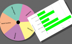
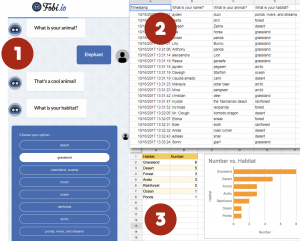
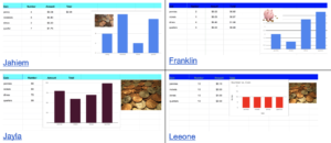
Third graders at Laburnum Elementary have been learning about coins and money (SOL3.6), so today students in Ms. White’s class made coin calculators with Google Sheets. I gave them a template to get started (you can make a copy of it here). It has the header row already filled out. I showed the students how to change the font and color of the row by clicking the #1 on the left side and highlighting the whole row. Next we listed all the coins in column A: quarter, dime, nickel, penny. In column B they could type any number they wanted between 1-10 for the number of coins. In column C we wrote some code to calculate the value of that number of coins by multiplying the number in B with the decimal value of the coin. For example, the code for quarters is: =B2*0.25. So if there were 7 quarters, the code would solve 7 x 0.25 = $1.75. I showed them how to format Column C to display the numbers as currency (Format > Number > Currency). We typed code for each coin and tested it by typing different numbers in column B. The students were very excited to see their code actually working! Then we added an image of money and pressed the Chart button to make a bar graph of the number of coins. Finally we clicked the Share button and set it so anyone with the link could find it. We published our spreadsheets on Schoology, but you can see them all here.


4th Grade Probability Spinners

Fourth graders at Varina Elementary have been learning about probability (SOL4.13) and graphing (SOL4.14), so today students in Ms. Connell’s class created probability spinners and graphed the results. First, they chose a topic for their probability spinner, such as sports, animals, shoes, colors, games, foods, etc. Next, they opened a Google sheet and typed a list of items that belong with that topic in Column A (for example, if they chose sports, they might type baseball, soccer, football, basketball, etc.). I instructed them to list some items more than others to increase the probability for those items. Then we copied all of Column A and went to WheelDecide, which is a free, customizable, online spinner. We clicked the “Paste List” button and pasted our list into the box. Now we have a spinner with all our items on it. Back in our spreadsheet, in Column B, we predicted whether it would be “Likely” or “Unlikely” for each item to be selected by the spinner. Of course, multiple items would be more likely. We tested our predictions by spinning the spinner 24 times and tallied the results. Finally, we recorded the results in Column C of our spreadsheet and clicked the “Insert Chart” button to generate a bar graph of our data. You can see the students’ spinners and spreadsheets here.


3rd Grade Patterns and In-Out Boxes

Third graders at Varina Elementary have been learning how to identify, create, and extend patterns in Math (SOL3.16), so today students in Ms. Lanham’s class created patterns with Google Sheets. First, I gave the students a template to use that has fewer cells and a larger font size than Google’s default spreadsheet. Since this was the first time many of them had seen a spreadsheet, I explained that each row in a spreadsheet has a number, each column has a letter, and each cell is labeled with a combination of both (like A2 or C4). This is important to understand when it comes to writing formulas later. The top row usually has the column names, so I showed them how to highlight the row by clicking the number 1 on the left, and we made it all bold by clicking the Bold button in the toolbar. Then we typed the column names: In, Out, and Pattern. In-Out boxes are a great way to get students thinking about patterns because they focus on just two numbers (the number that goes “In” the box and the number that comes “Out”) and infer what happens inside the “Box.” The students typed a few random numbers in the first column. In the second column, they wrote simple formulas such as =A2+5 or =A3-3, and when they pressed “Enter,” they saw what came out of the “Box” they created. Some people may think spreadsheets are boring, but students get very excited when they see their formulas work. They especially enjoy this next trick to continue the pattern: click on a cell in the second column (one with a formula) and a blue box should appear; click and drag the bottom corner of the blue box across the rest of the row, and it automatically fills with the continued pattern! Finally, I showed the students how they could click the “Explore” button in the bottom right corner of the spreadsheet and choose their Formatting colors (or they could highlight rows and columns and make them whatever colors they wanted). We shared our spreadsheets on Schoology so their classmates could guess the patterns by typing a reply like, “Row 3 is +5.” You can see their spreadsheets here.


4th Grade Decimals Calculator

Fourth graders at Trevvett have been learning about decimals up to thousandths. They have learned how to compare decimals and round them (SOL4.3). Today, students in Ms. Cockrum’s class created their own decimals calculators with Google sheets. First, I asked if they knew of a calculator that could add or subtract decimals. They all did. Then I asked if they knew of a calculator that could compare or round decimals. None of them did, so they were very surprised when I explained that they would create a calculator that could do that. I pointed out that they would be coders today, and I wanted them to go through the same process that coders go through when creating a new program or app. Coders often start out with a flowchart to make sure that each step of the code is in the correct order. We discussed the steps a calculator would need to go through to compare two decimals. It would have to decide if one of the numbers was equal to (=), greater than (>) or less than (<) the other. Then it would have to display the correct symbol. A decision on a flowchart is usually a diamond shape, and the answer is either "yes" or "no." So our first decision could be, "Is A greater than B?" If the answer is "yes," the code would display a ">” symbol. If the answer was “no,” the code would continue to the next decision. The next decision might be, “Is A less than B?” and so on. The decisions could be in any order, but the final step isn’t really a decision, it would be a command to display the only symbol that was left. The shape for output in a flowchart is usually a parallelogram, but I told them they could use whatever shape they wanted. We used Google draw to make the flowcharts, then we opened this template in Google sheets to create the code. I instructed the students to type any decimal they wanted in the decimals columns. Then we wrote code, or formulas, in the other columns. Rounding is the easiest, so we started with that. I showed them the code for rounding to the ones place, then I let them figure out the code for rounding to the other places. The code for rounding a number in cell E2 is: ones place =ROUND(E2,0); tenths place =ROUND(E2,1); hundredths place =ROUND(E2,2). Next, we used our flowcharts to write the code for comparing decimals. If decimals are in cells A2 and C2, the code to display the symbol would go between them in cell B2. It may look something like this (but it could be in a different order):

=IF(A2 > C2,”>”, IF(A2 < C2,"<","="))

The students were excited to see their calculators working, and if they didn’t work, the students had to think critically and problem-solve to figure out the reasons. That’s actually one of the most valuable lessons of learning how to code. Our final step was to share the links to our spreadsheets on Schoology. You can see some samples from Ms. Cockrum’s class and Ms. Messer’s class (5th grade) here.


5th Grade Hurricane Hypothesis

Fifth graders at Varina Elementary have been learning about the scientific method: forming a hypothesis, collecting data, taking measurements, graphing information, and analyzing the results (SOL5.1). Since Virginia is currently facing the threat of Hurricane Florence, and since the 5th graders need to review weather (SOL4.6), we decided to research hurricanes using the scientific method. First, I showed them some photos of past hurricanes and identified the eye of the hurricane. If the “eye” is the center, then the “eyelid” can be the area near the eye, and the “eyebrow” can be a bit further out. What part of the hurricane has the strongest winds? We made a copy of this spreadsheet, and I asked the students to write their hypothesis in the purple box. For example: If the distance from the eye increases, the windspeed will increase (or decrease). Now it was time to make some measurements and collect data. We went to Windy and Earth which show live storms on the Earth. You can click anywhere in the storm to get the windspeed (you may need to go to settings to change the units to mph). We used Accuweather or the National Hurricane Center to get the names of the hurricanes. The students could measure the winds in any hurricane they wanted, and I pointed out that the more data they collect, the more reliable their conclusions will be. They recorded the information in their spreadsheet, including the name of the hurricane and the windspeed measured at the eye, eyelid, eyebrow, and maximum (found by just searching around the storm for the biggest number). Finally, I showed them how to graph the data and customize the colors. We analyzed the results to confirm or revise our hypothesis. Most of us discovered that the strongest winds were in the eyebrow area, so as the distance from the eye increased, the windspeed increased. You can take a look at some student samples here. UPDATE: Schools closed the next day, 9/14, due to Hurricane Florence, and on 9/17 we had tornados!


3rd Grade Mali Perimeter & Area

Third graders at Trevvett Elementary have been learning about perimeter and area in Math (SOL3.10), and they have been studying the ancient civilization of Mali in History (SOL3.2). Today, students in Ms. Cockrum’s class found the perimeter and area of the famous Malian city, Timbuktu. First, we found Timbuktu on Google maps and used the scale to estimate its perimeter and area. To record our data, we made a copy of this spreadsheet that I had prepared ahead of time with the correct font sizes and cells. I demonstrated how to make some practice shapes by clicking and dragging through the cells and using the paint bucket to change the fill color. Then we used the squares to calculate the perimeter and area of our shapes and entered the values into the corresponding cells. Now the students were ready to measure Timbuktu, Mali. We made a copy of this Google drawing to make the process a little easier. The students could click and drag the square miles around the perimeter (turning the squares by dragging the blue circle that appears over each one when it’s clicked), and they could drag the squares inside of the city to find the area. The squares are transparent so the students could see what is underneath. Once they found the perimeter and area of Timbuktu with the squares, they entered the values into their spreadsheet. Finally, we clicked the Share button on our spreadsheets and pasted the links into Schoology. You can take a look at them all here.


5th Grade Mean, Median, Mode, and Range

Fifth graders at Varina Elementary have been learning how to find the mean, median, mode, and range of a set of data (SOL5.16c). They have also been making stem-and-leaf plots (SOL5.15). Today students in Ms. Primrose’s class discovered how to accomplish these tasks using a Google spreadsheet. First, we opened a blank spreadsheet by clicking the shortcut button (the 9-squares at the top of a Google search page). We discussed how the spreadsheet grid is similar to a map grid, with letters along the top and numbers along the side. Each cell has a name based on its letter and number (such as B6 or D9). The cell name stays the same, even if the data inside it changes. I explained that we will be using the cell names to create our formulas for mean, median, mode, and range. This concept of cell names is a great way to help students understand variables (SOL5.18a). Next, we labeled each column: Random, Number, Stem, Leaf, Mean, Median, Mode, Range. I showed them how they could highlight the whole row by clicking 1 on the side and change the font, size, and color. We clicked in A2 and typed our first formula for generating a random 2-digit number: =RANDBETWEEN(10,99). Then we clicked in B2 and typed the number we saw in A2. When we pressed the Enter key we went down to B3 and typed the new random number we saw in A2. We continued doing that until we had about 20 random numbers down column B. To make it easier to create the stem-and-leaf plot, we added some conditional formatting to column B (highlight the column by clicking the B at the top, then click Format > Conditional formatting). We added 9 rules making the cell a different color if the number was between two tens (for example, make the cell red if the value is between 20-29). Now we clicked in the C column (Stem) and typed 1-9 down the cells for our stems. Since the leaves had to be next to the stems, we highlighted the D column (Leaf) and changed the alignment from right to left using the Horizontal align button at the top. Then we used our colors to help us count and enter the numbers. Finally, we used formulas to calculate the mean, median, mode and range in their respective columns:

=AVERAGE(B2:B21)
=MEDIAN(B2:B21)
=MODE(B2:B21)
=MAX(B2:B21)-MIN(B2:B21)

To show the value of using variables (cell names, like B2), I instructed the students to change some of the numbers in Column B. The formulas instantly recalculated their values! We shared our spreadsheets with each other on Schoology, and you can see them all here.


5th Grade Comparing Fractions & Decimals

Fifth graders at Varina Elementary have been learning how to compare fractions and decimals (SOL5.2). Today students in Ms. Messer’s class learned how use a spreadsheet to convert fractions to decimals and compare them. First, we opened a blank Google spreadsheet and wrote the following column headers: Fraction 1, Compare, Fraction 2, (Blank), Decimal 1, Compare, Decimal 2. In order to make the two fraction columns look like fractions, I showed them how to click in the numerator cell, then use the cell format button (it looks like 4 squares in the toolbar) to add a line at the bottom. Then they entered a numerator and a denominator for the two fractions. To convert the fractions into decimals, the students needed to write a formula. I explained that the formula would use cell addresses (like A2 or C3) instead of particular numbers so that we could change the numbers and the formula would still work. This is a great way to help students understand the concept of a variable (SOL5.18). They helped me develop the formula =A2/A3 for the first fraction, and I expected them to figure out the formula for the second fraction =C2/C3. The formula for comparing them is a bit more complicated, but they were able to figure it out with guidance:

=IF (E2 > G2, “>”, IF (E2 < G2,"<","="))

Basically it says if the left decimal is greater than the right decimal, show the greater than symbol; if it’s less, show the less than symbol; otherwise show equals. Finally, we added a simple formula to compare the fractions by just copying the same symbol from that cell =F2. The students were excited to see their formulas work, even when they changed the fractions. You can see all their examples here.


4th Grade Virginia Tally Marks & Graphs

Fourth graders at Varina Elementary have been learning about Virginia geography (VS.2) and Jamestown (VS.3) in Social Studies, and they have been making bar graphs in Math (SOL4.14). Today students in Ms. Belcher’s class chose a Virginia topic, created a spinner out of its subtopics, tallied the spins, and graphed the results. First, we reviewed various topics they could use to generate their spinner subtopics: Virginia Rivers, Virginia Regions, Indian Language Groups, Problems at Jamestown, Bordering States, etc. Next, we created our custom spinners using a cool webtool called WheelDecide. Then they spun the spinner as many times as they could in two minutes and tallied the results on paper. To make the graph, we used a Google spreadsheet. I showed them how to access their Google shortcuts (the array of 9 tiny squares in the top right corner of a Google search page), and we opened a new spreadsheet. In the first column we typed the spinner subtopics, and in the second column we typed the number of tallies for each one. Then we highlighted the columns, pressed the graph button, and a bar graph appeared! I showed the students how to change the colors of the bars, if they wanted. We shared our spreadsheets on Schoology, but you can see them all here. Can you guess the main topics just by looking at the graphs?


3rd Grade Animal Habitats Graph

We’re on an animal habitats streak here! In previous posts I’ve shown how your habitats unit (SOL3.4) can reinforce the skills you are teaching in Social Studies and Reading. Now we’ll see how it can reinforce Math concepts as well. At Trevvett Elementary, third graders have been learning about graphing (3.17), so today students in Ms. Bae’s class practiced graphing animal’s habitats. First we had to collect some data. I used Fobio to convert a Google form into a chatbot to make the process a bit more interesting. You can try the chatbot out for yourself by clicking here. Once the students had entered their information, I took a screenshot of the results spreadsheet and posted it to Schoology (step 2 in the graphic accompanying this post). Next the students opened a blank Google spreadsheet and typed the habitats in Column A and the number of animals in Column B. I showed them how to use the new “Explore” feature by clicking the star shape in the bottom right corner. From the pop-up window they could change the colors of the rows and automatically add a bar graph (step 3 in the graphic). I explained that they could also change the colors of the bars by double clicking on one of them, then clicking the paint bucket in the pop-up window. The students shared the links to their spreadsheets on Schoology. You can see an example here. (UPDATE: The next day at Holladay, Ms. Haley’s class combined Math & Science by writing math word problems about animals. See them here).